oh em gee the studio is done!!!! although i am calling this post the “before” it is technically the after because this room didn’t even used to exist. if you have been following along on instagram, i shared in the fall that justin & i were building a studio addition to our 1928 craftsman home. we had local architect forest green creations design us a room that dreams are made of & the construction officially began in october with lynchwood design & build. we have been planning this room since we bought the house in 2016 & it was so worth the wait. i take months to decide on a sweater, so you can only imagine how long it would take me to decide on finishes.
it is truly the room our little house was missing & i cannot get over stepping into this studio every morning to have my coffee & answer e-mails! it is a multipurpose room to be used as both my photography studio & office so let’s call this blog post the after of the before. does that even make sense? idk, but i just really wanted to showcase the room itself before all the furniture goes in. so much thought & detail went into picking each fixture & finish, so i figured i would break that down for you in a blog post! this is the first time i got to design a space from scratch & it was seriously so much fun. justin, can we do it again? haha
the walls:
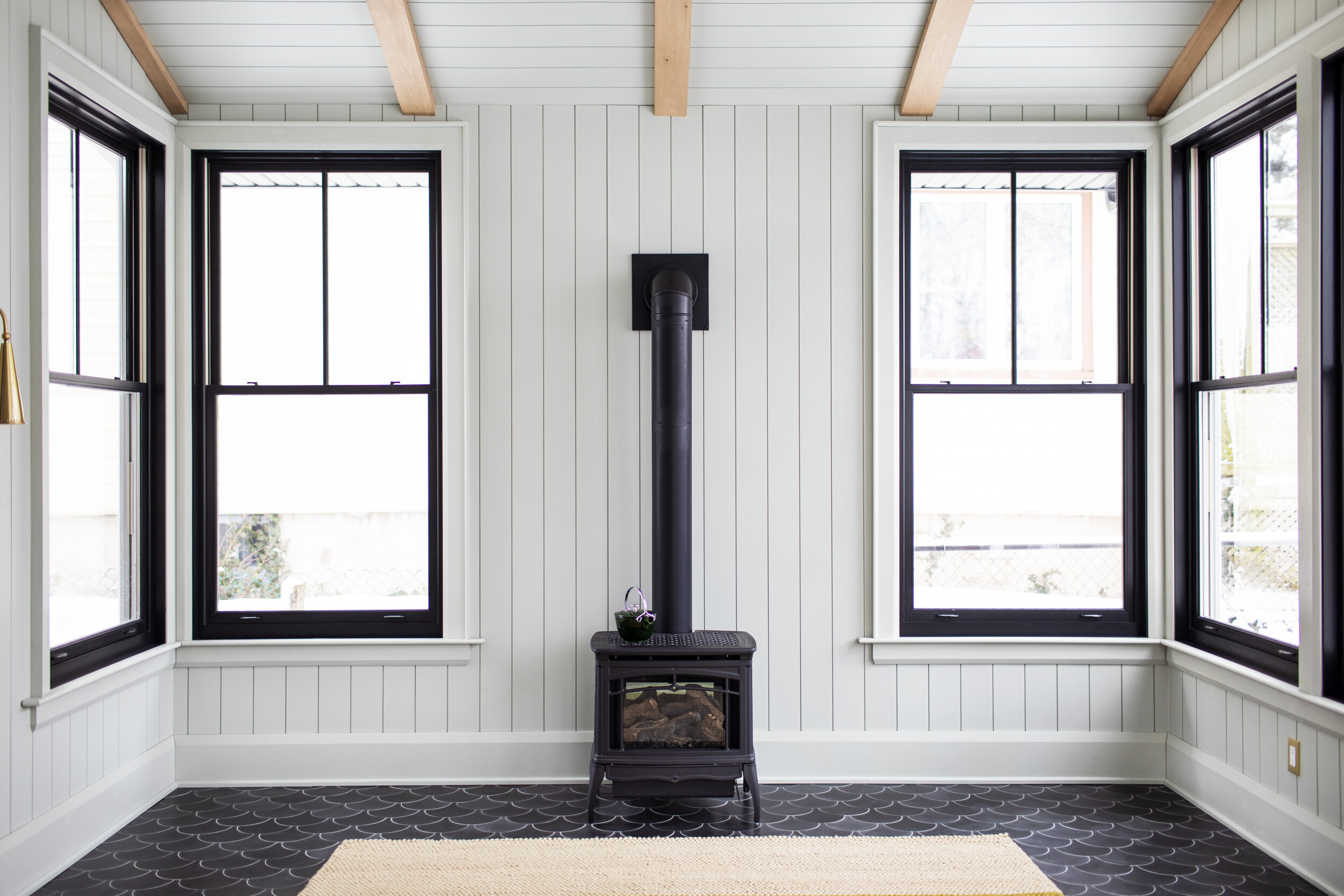
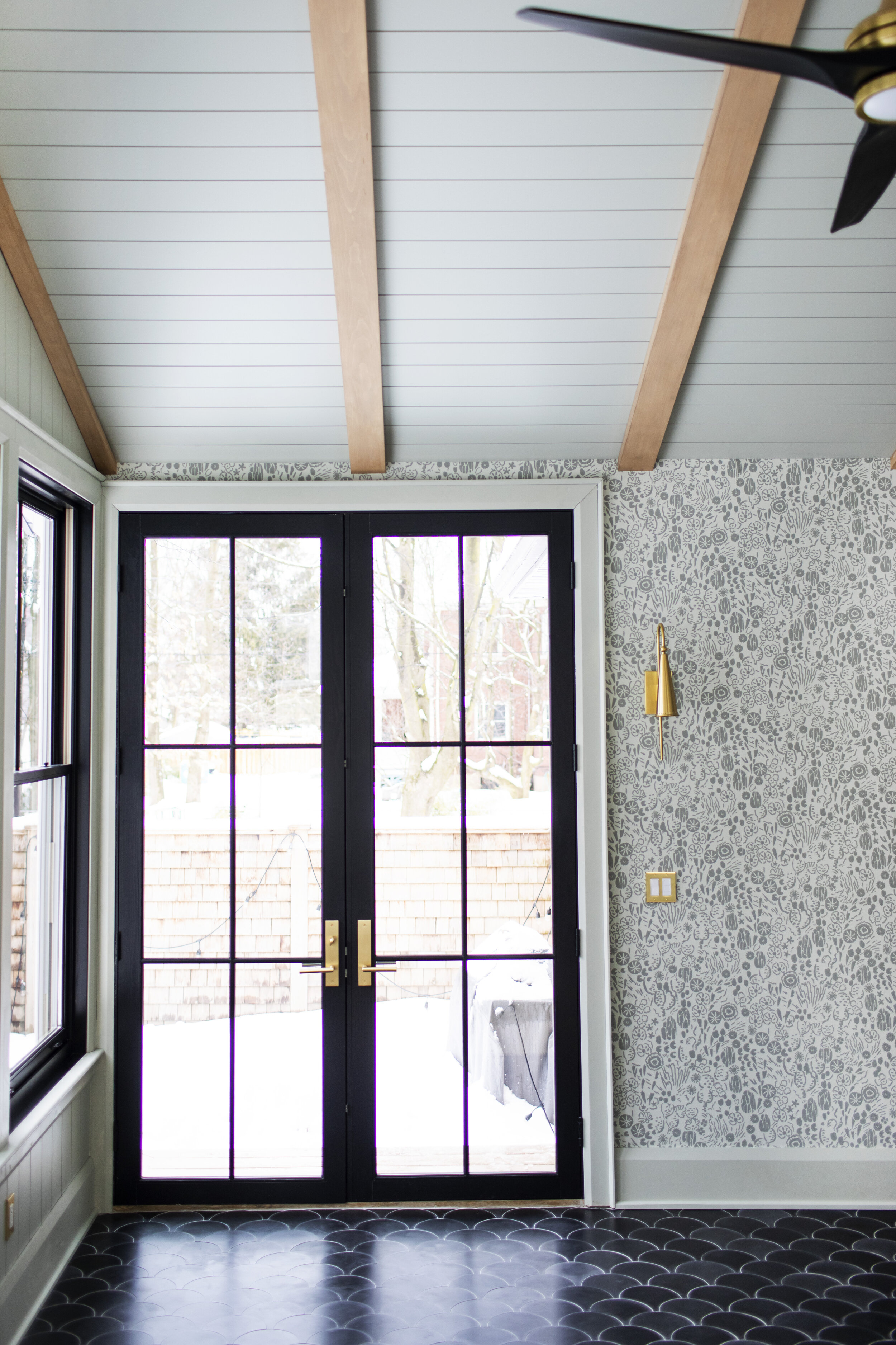
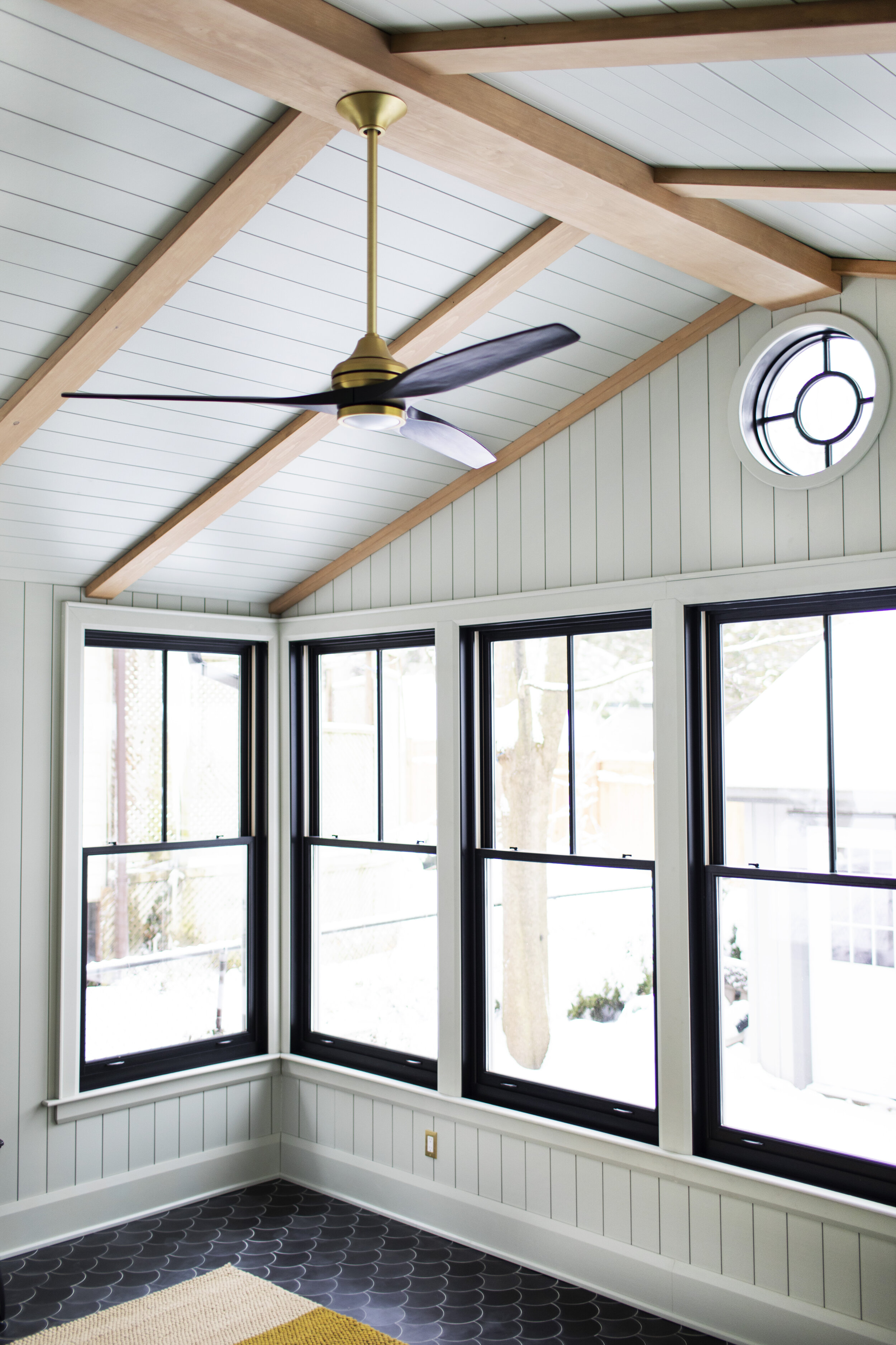
i knew right from the beginning that i wanted the room to be finished floor to ceiling in vertical shiplap. it gives it such a cozy cottage vibe & adds that extra bit of character to the walls that drywall doesn’t bring. we went with the metrie complete 5.5 inch polar white shiplap. although we didn’t install it ourselves, the builders said it was a breeze to install! it works both horizontally & vertically, so we switched it up for the ceiling & had the shiplap run opposite to the walls. we went with the 12 foot length boards which eliminated any visible seams.
the paint:
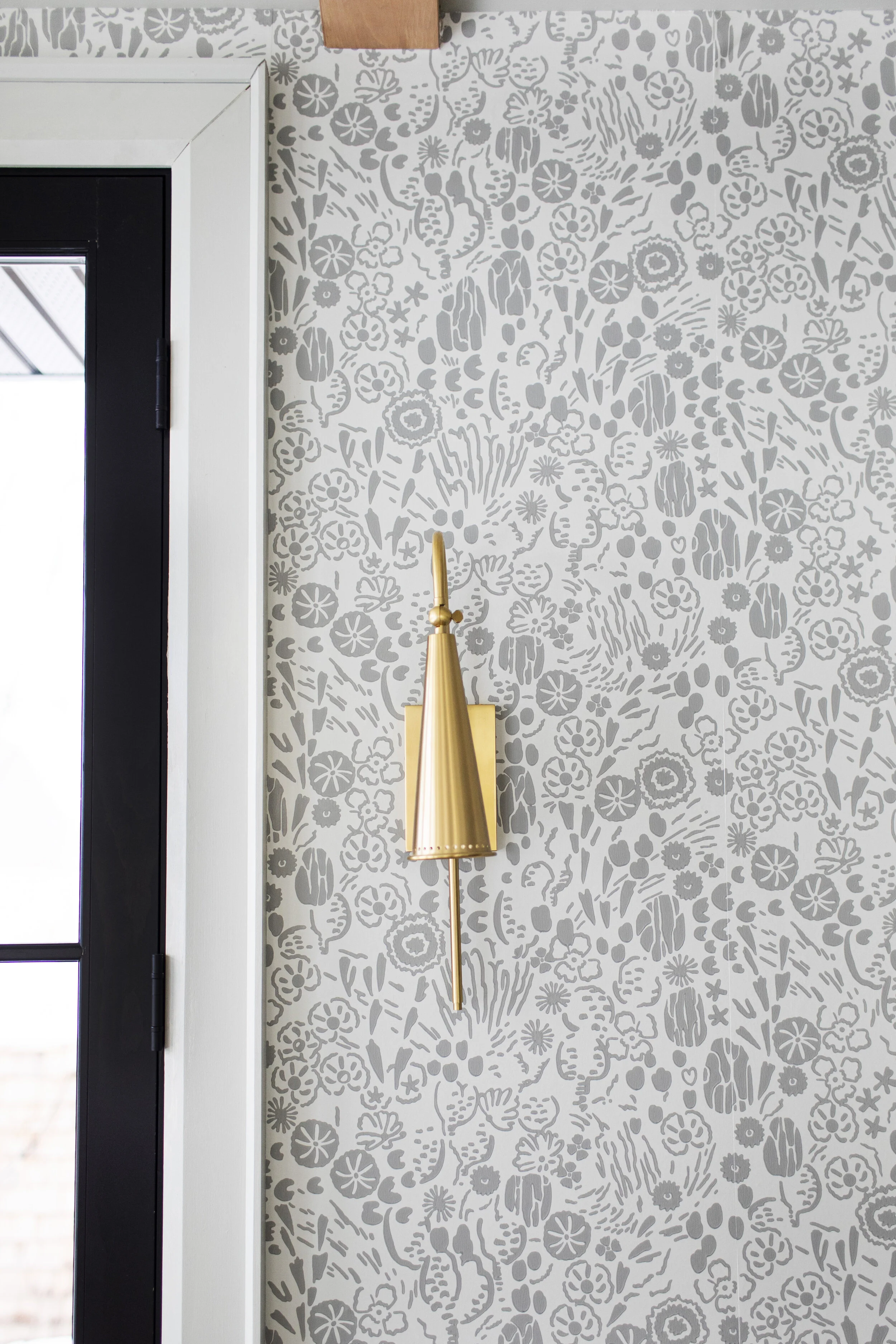
another thing i knew from the beginning is that i did not want the room to be white. i find white spaces a little boring (unpopular opinion I know) & would not fit the craftsman vibe of the rest of the house. i didn’t want the space to look like you were walking into a different home, but i still needed something neutral for imagery. i was stuck narrowing down what colour to pick, so i used farrow & ball’s virtual colour consultation which helped me land on the most perfect colour ever: mizzle. i seriously can’t even picture this space another colour & i am now obsessed with mizzle. the colour consultation was extremely valuable, especially with the scale of this project & knowing that the colour had to be perfect the first time around. it entailed an hour video chat with a designer. prior to the chat a colour book is sent out & afterwards three sample paints are delivered. the consultant helped me bring in that green shade i was craving, without going too green. mizzle is that kind of colour that changes as the light changes, sometimes it looks a beautiful soft green & sometimes it looks a beautiful soft grey. because the windows were going to be black, we agreed to do the trim in the same colour to not take away from the boldness of the windows. lastly, even though I told justin i wouldn’t add anymore wallpaper in the house (who really believed me).. i added one accent wall in the sunroom. ok but how perfect is the print atacama (BP5803) by farrow & ball? it is a print inspired by a brightly coloured swatch found in an old fabric mill. it has a cacti theme, which i felt really suited the space. it also makes for a beautiful backdrop like the kitchen wallpaper!
the floor:
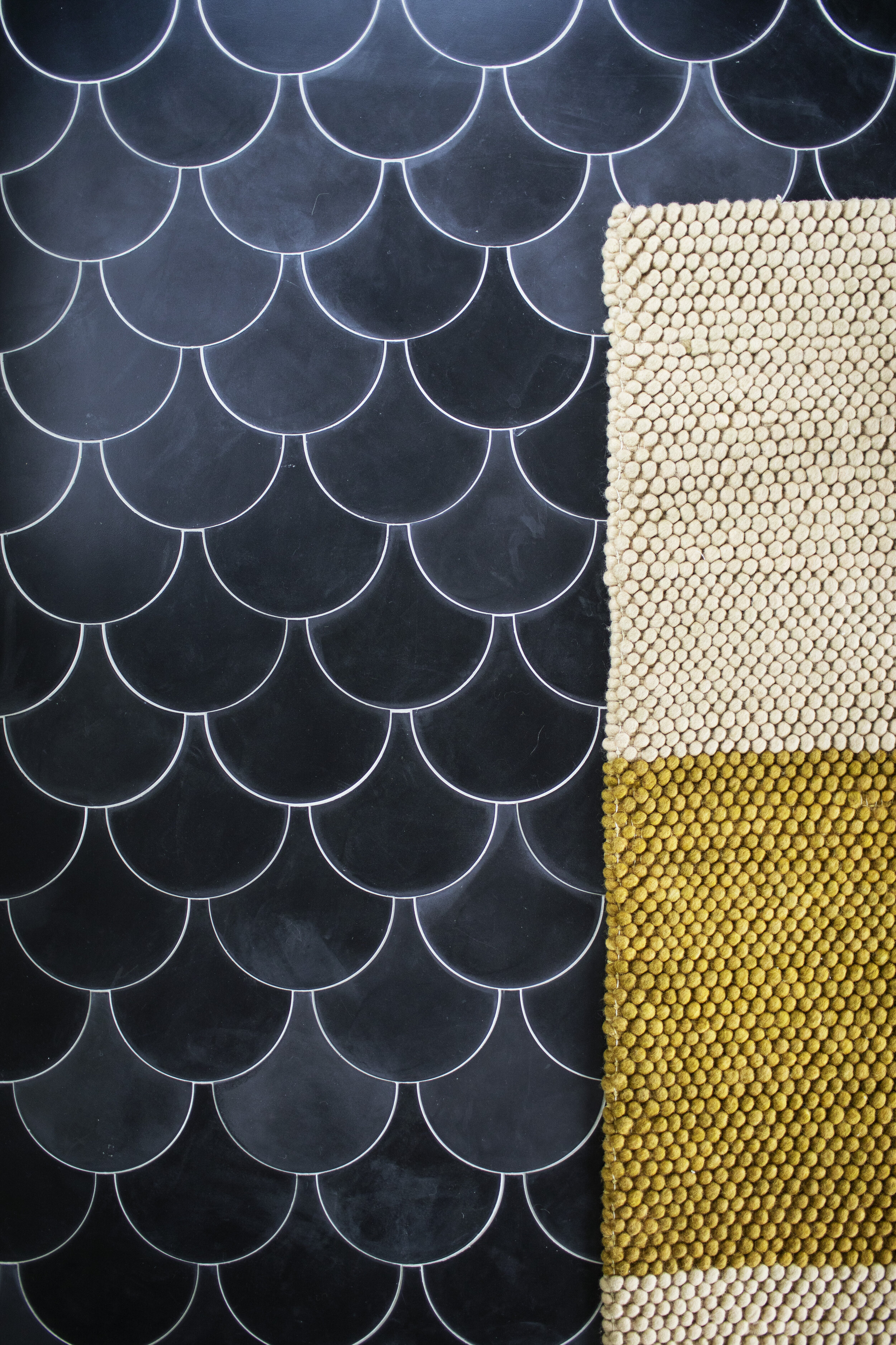
ok, that floor though! i wish everyone could see it in person because photos will not do it justice. it is a cement morrocan fish scale tile in solid black from villa lagoon tile & it is stunning. each tile is hand made which gives them a perfectly imperfect finish & natural variations in the colour. all the beautiful shades of black give this space such an organic look. because these tiles are made using a centuries old process, i knew they would bring in the character this new addition needed. the tiles are made from marble, portland cement & natural mineral pigments. the colour runs deep, so the tiles can be sanded & refinished in the far away future. lastly, cement tiles are not fired in a kiln like porcelain tiles, making them environmentally friendly as they use little energy to produce & create no pollution from the burning of fossil fuels. these tiles feel like walking on art & i know they will be here for another 100 years looking just as gorgeous.
the fixtures:
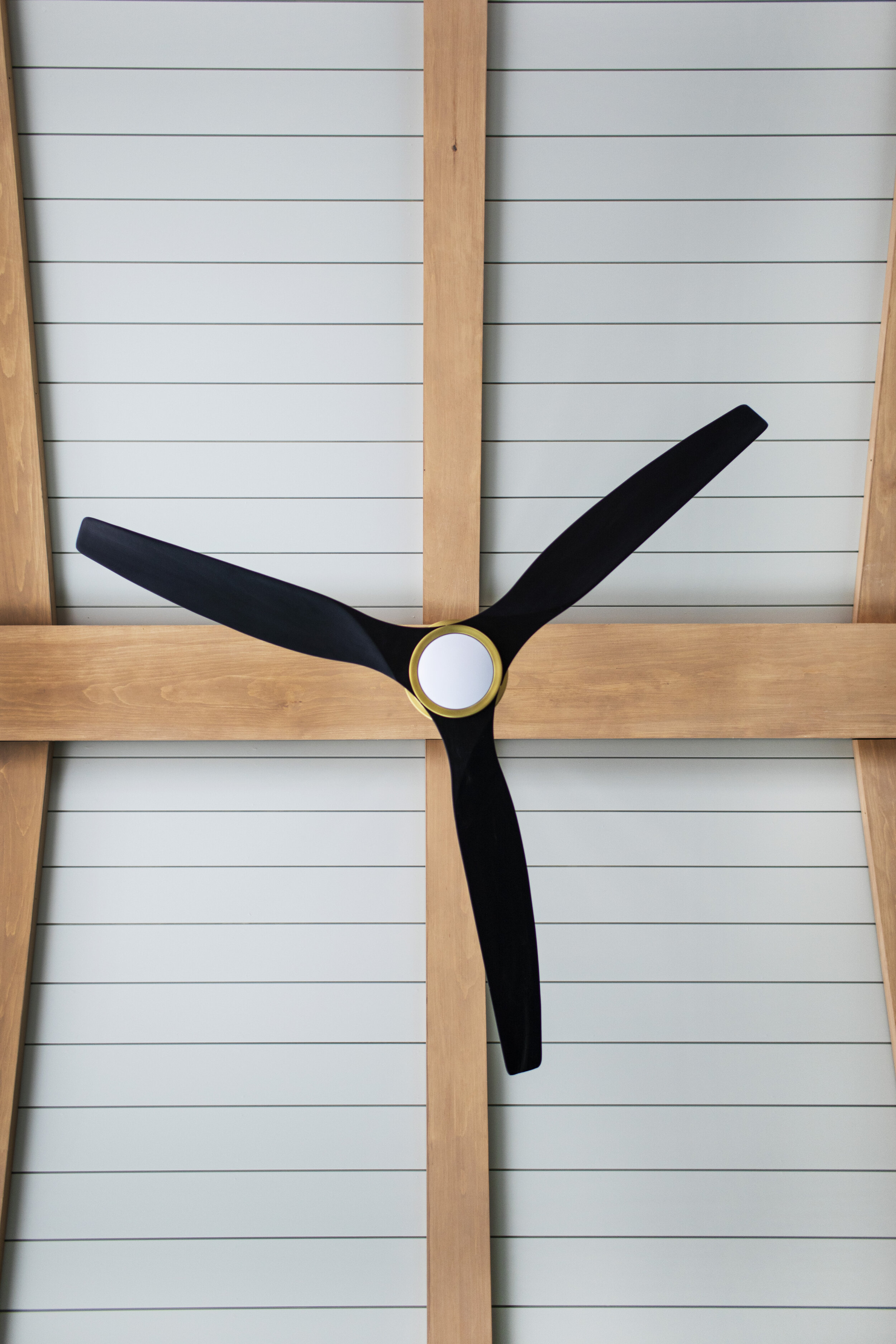
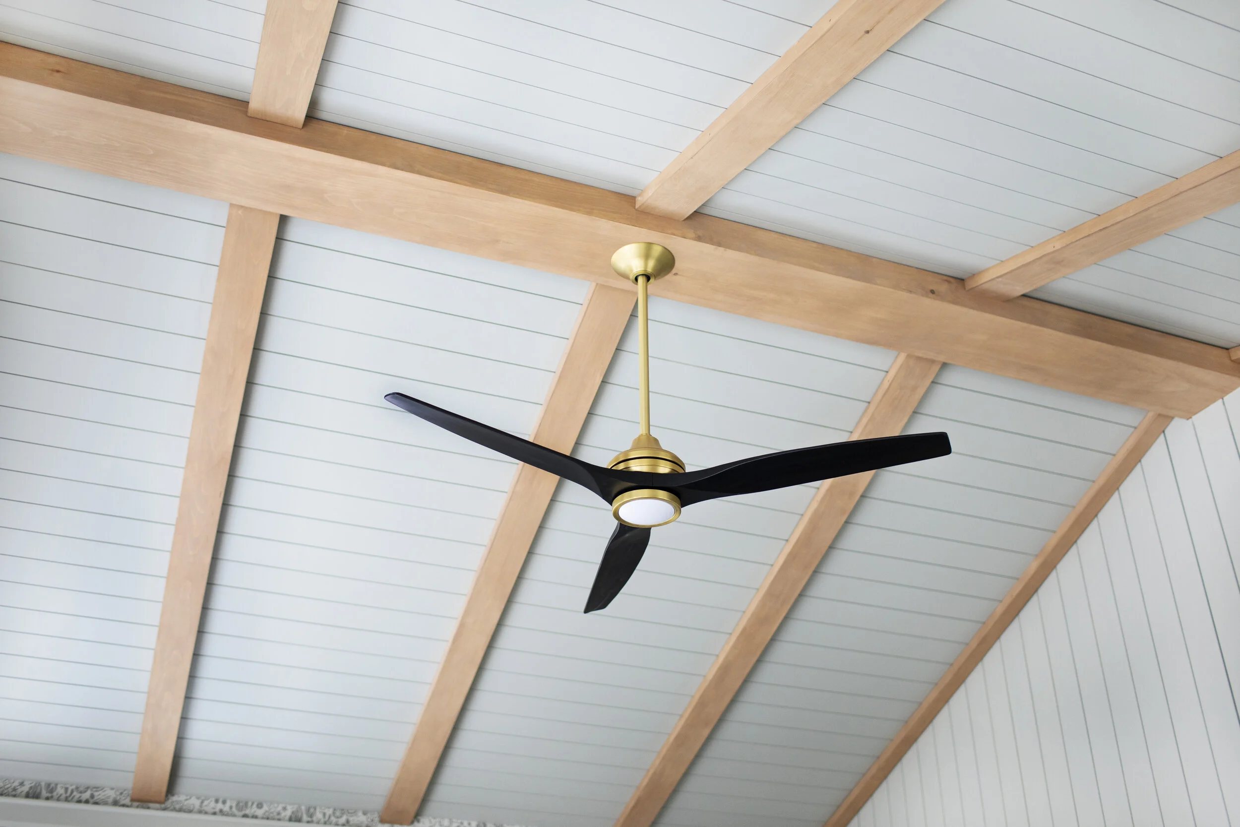
the only ceiling fixture in the studio is a fan, so it needed to be a fan that was pretty enough to be the focal point. the spitfire fan by fanimation looks like it was made for this space! each piece is sold separately so you can dream up any combination of finishes. to keep with the rest of the finishes in the space i opted for the brass fan (with the light kit) & the black wood blades. with the ceilings being 12 feet tall at the peak, i added an extension rod as well which i think really adds to the overall look of the fan. one cool thing to note is that the fan uses a handheld remote to turn on, off & adjust the speed. we also installed the wall control just to have easy access to turn on the main light when we enter from outside.
i also opted for a few wall lights for when we wanted subtle lighting in the space. we went with a samsung frame to disguise the television as art (it is also great for displaying my own photography), so to add to the look i installed the alva sconce light in aged brass from hudson valley lighting on each side of the frame. i just love the mid-century modern vibe of the sconce lights! although I didn’t want to bring it too much brass to the space, these felt like the perfect pop of brushed brass to bring into the design.
the hardware:
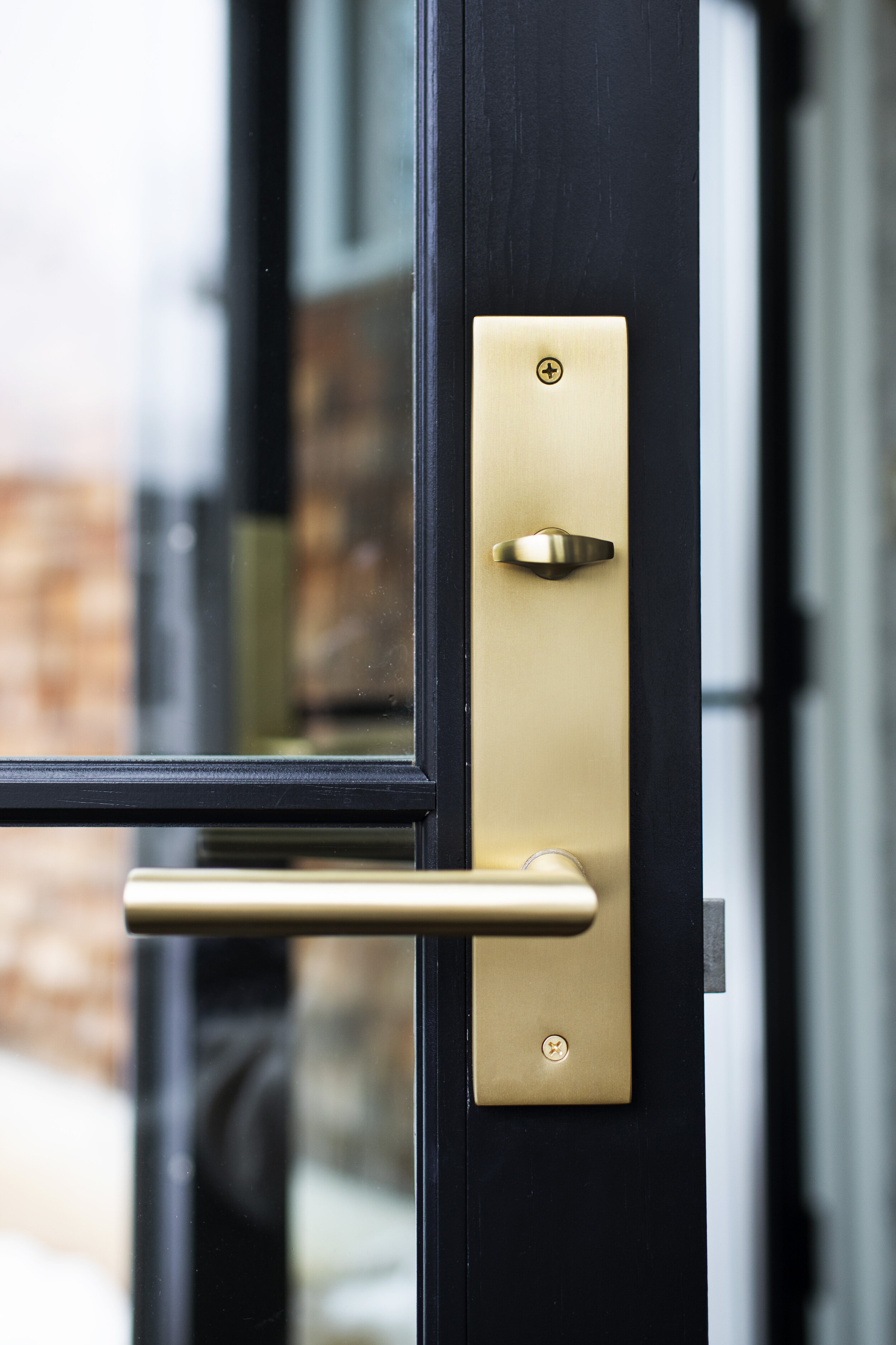
we installed a set of 9 foot tall wooden french doors & i knew they needed to be finished with extra special hardware! the doors lead to our backyard which will one day be a wrap around deck. because i did a split finish on the doors (grey exterior & black interior) i decided to do a split finish on the hardware as well. emtek makes arguably the most gorgeous hardware available, plus you can customize it to fit your space. i opted for a modern design (brass modern plate with stuttgart lever) with a black matte finish on the outside & satin brass finish on the inside. i ended up choosing the same hardware for my parents exterior renovation, but with a knob instead of a pull. you can basically design any hardware you can dream up with emtek, even marble pulls!
anyways, that’s all for now folks! i am including a little sneak peek at what is to come & share the mood board i created before the first helical pile even went into the ground. i created a lot of mood boards before settling on this one that I could probably go design about 50 rooms right now. i will link to the items below, as well as all the finishes featured in this blog post. can’t wait to share the final space! till next time xo
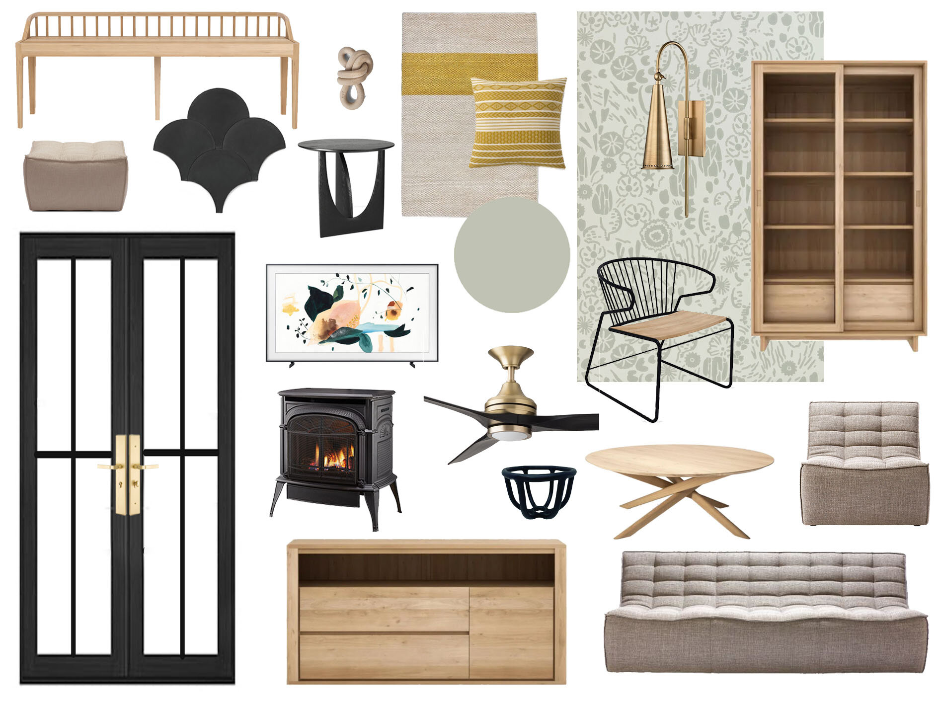
quick links: shiplap | fish scale tile | ceiling fan | door hardware | sconce lights | area rug | paint [wall + trim] | wallpaper | sideboard | spindle bench | display cabinet | sofa | chair | coffee table | side table