
SO if any of you have noticed, i added a new "interiors" page to the site in the new year & this will be the first official design post to go into that category! it is also the first design of modest house that i will be sharing with you, but many more are coming throughout the year. on a side note, did you see my living & powder room makeover was featured on DESIGN SPONGE this week!!! incase you missed it, you can read all about it here. now back to the powder room.
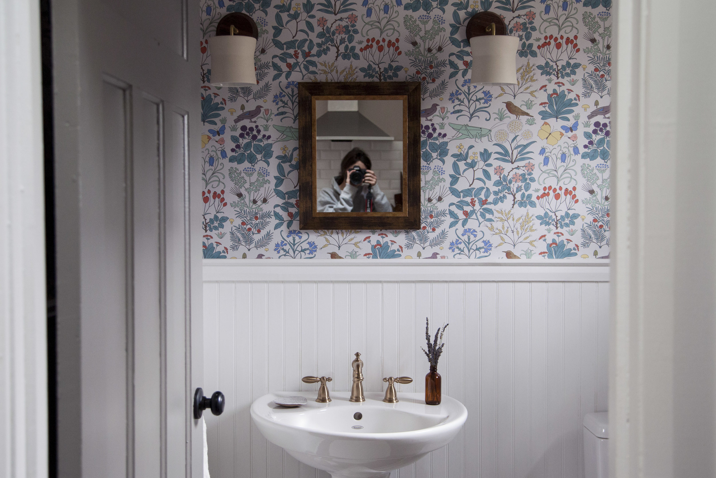
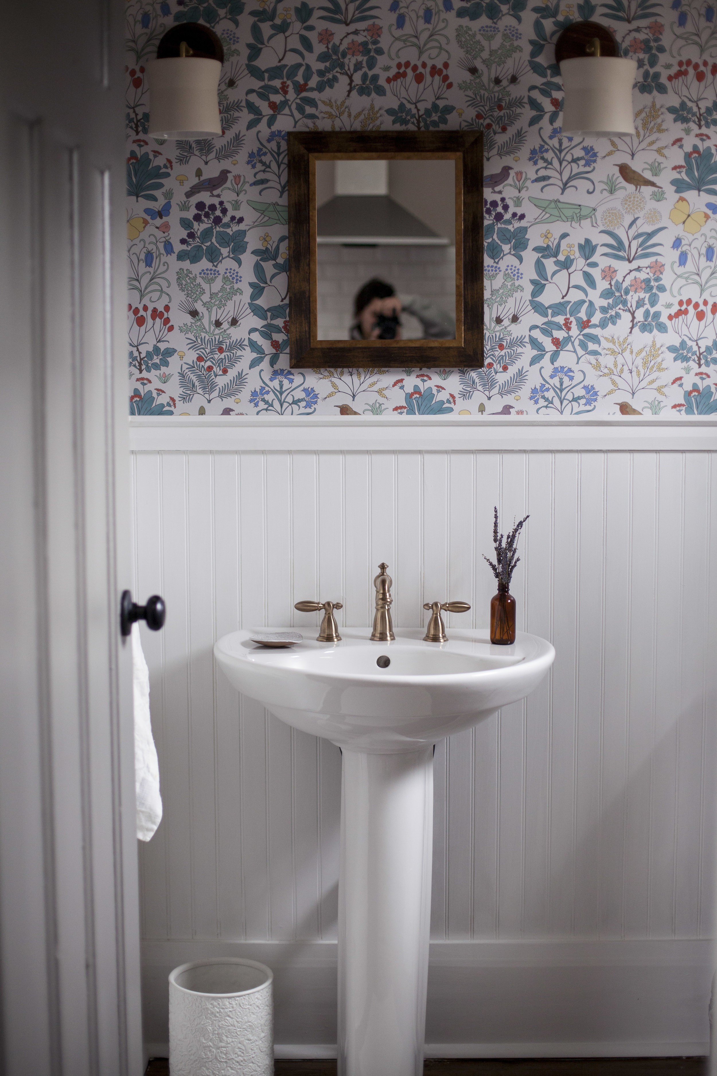
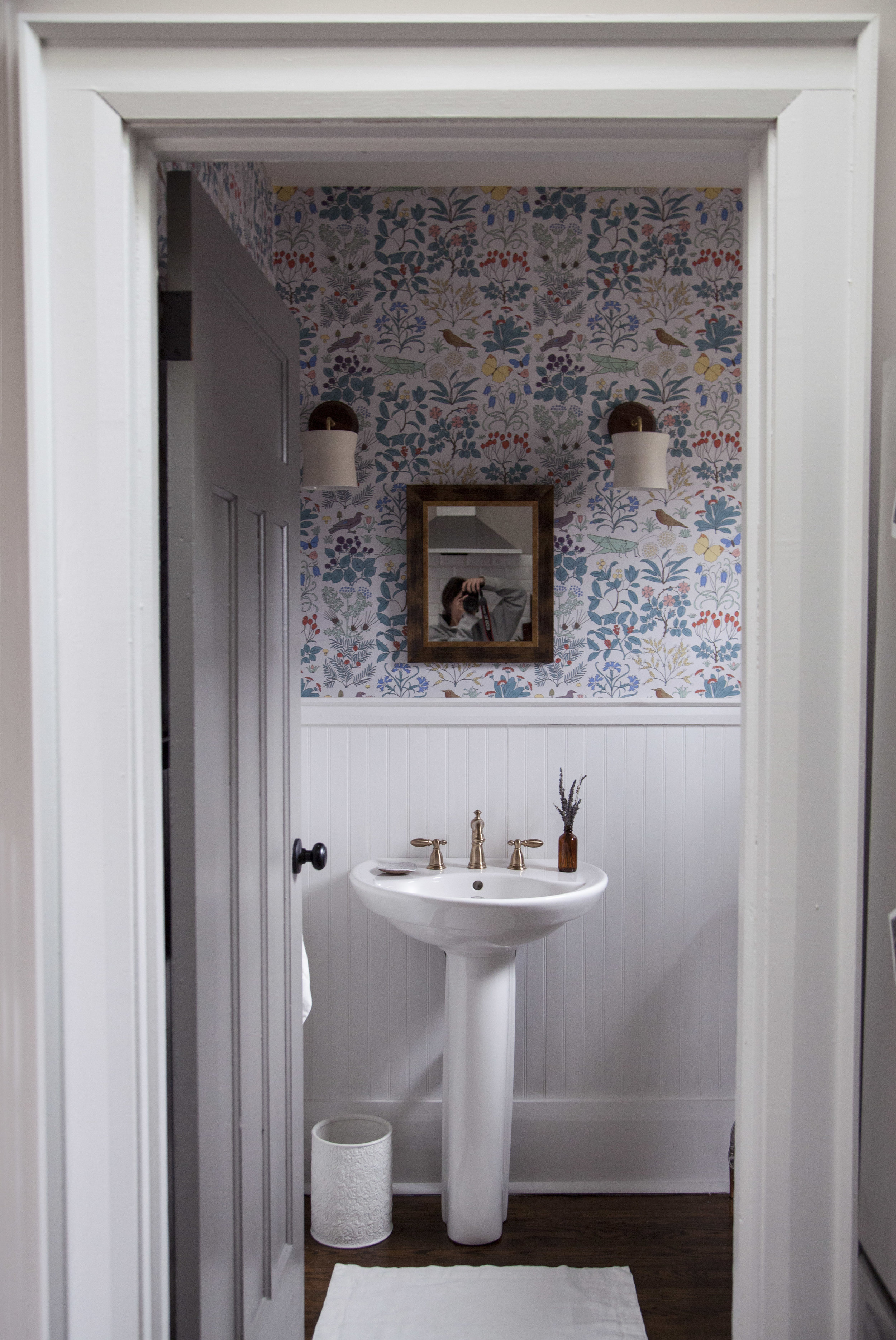
the first makeover i started planning in the house was the powder room. i started planning it the second we viewed the home to be honest, i knew i was going to make this house ours. while most of the house is quite monochromatic (i hear it over & over again from justin that it is too grey), i figured the powder room was the ONE room i could do something bold & colourful. to get started i had to decide on the two main design feature: the wallpaper & the faucet. everything else would fall into place once those were chosen.
step one: the wallpaper
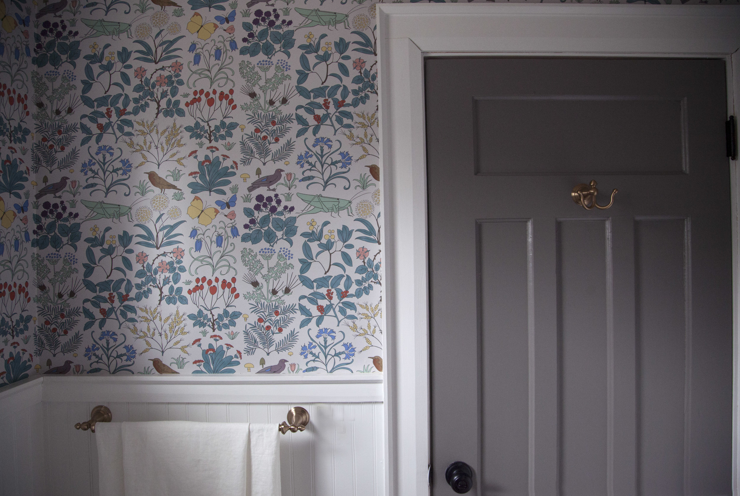
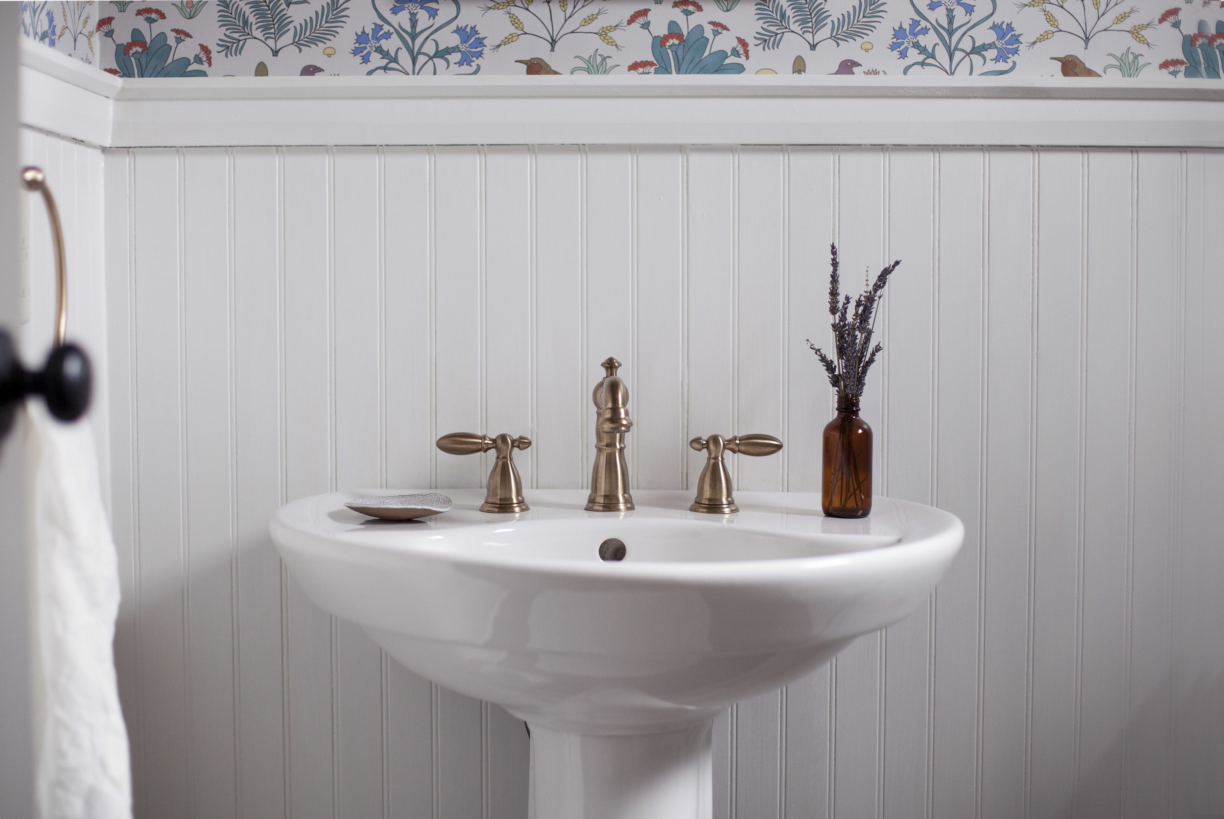
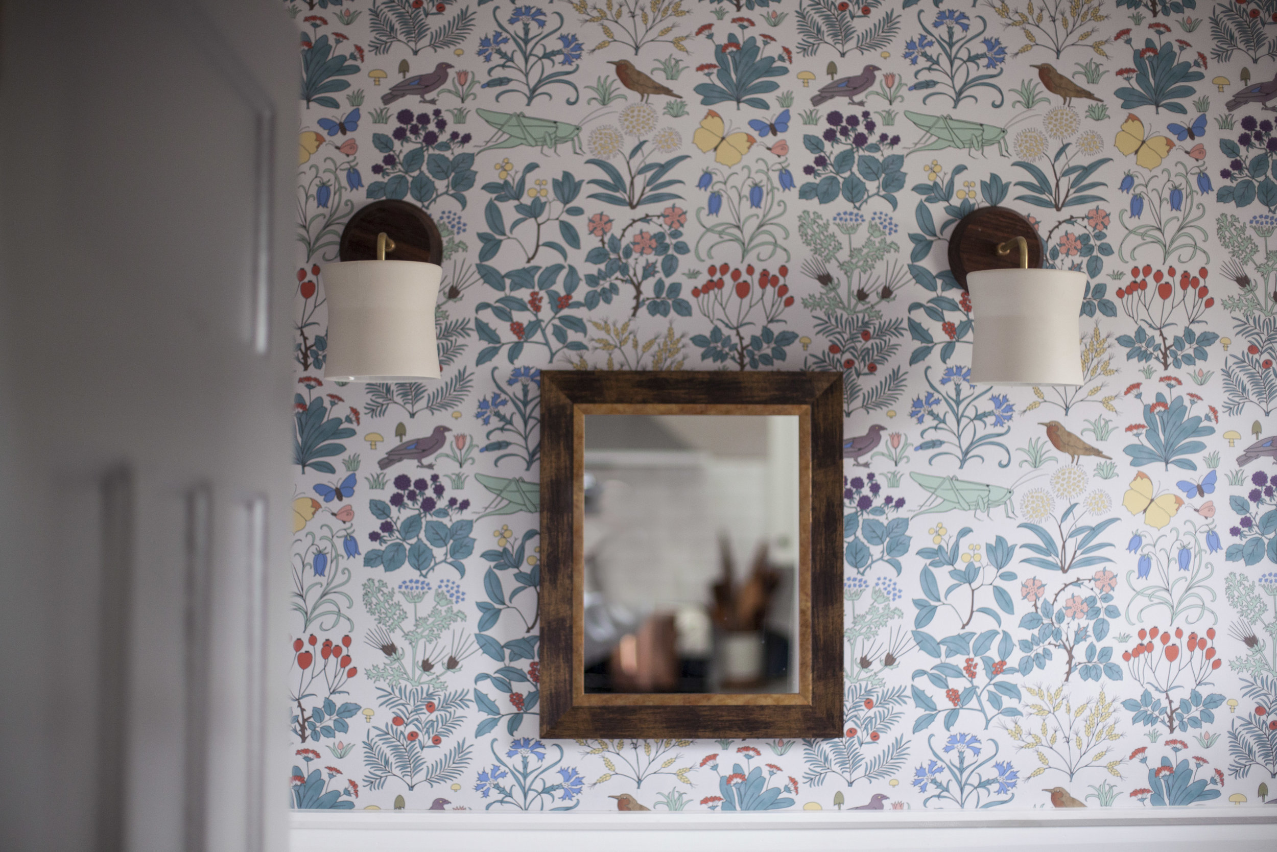
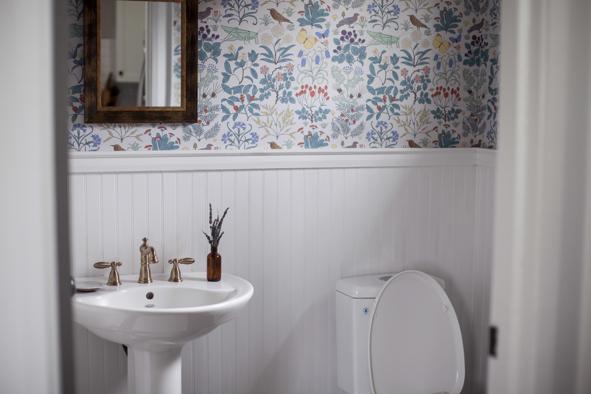
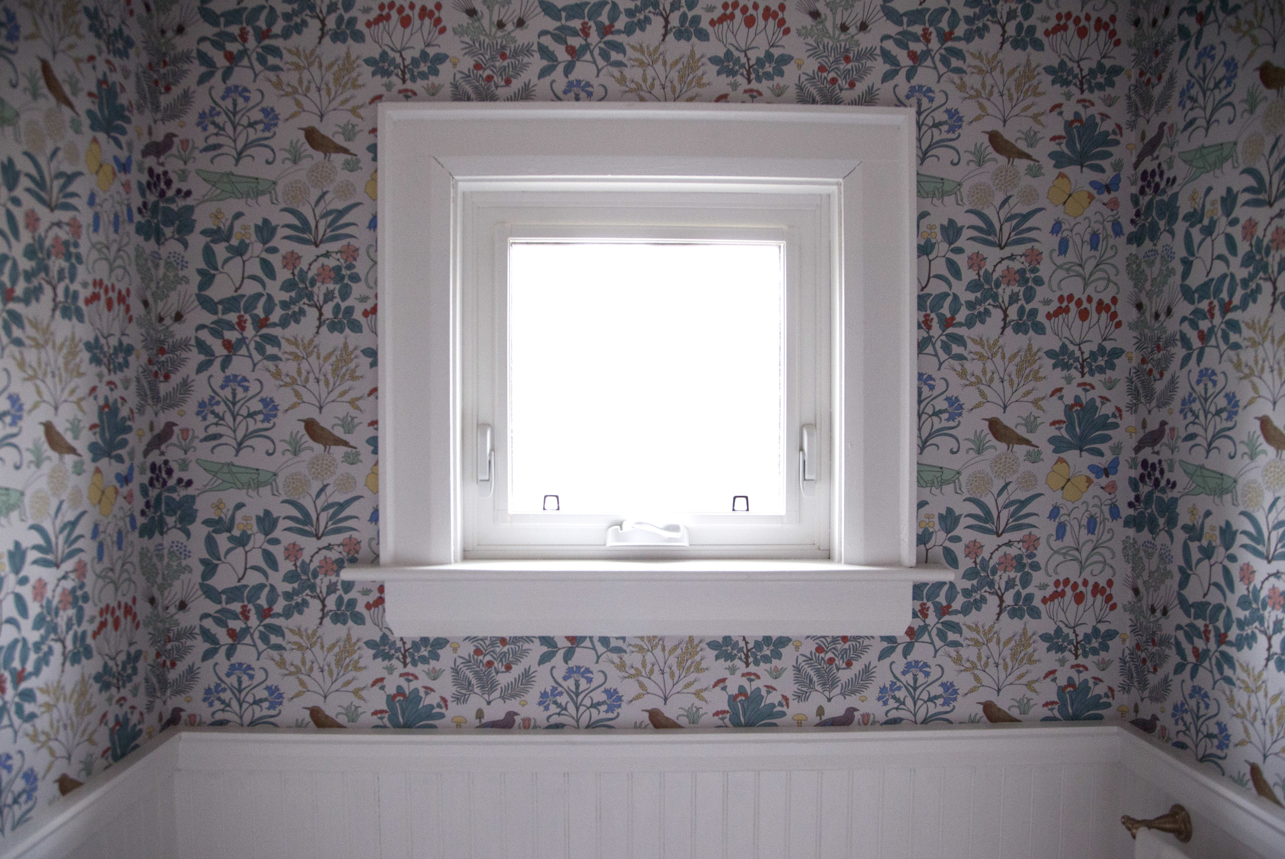
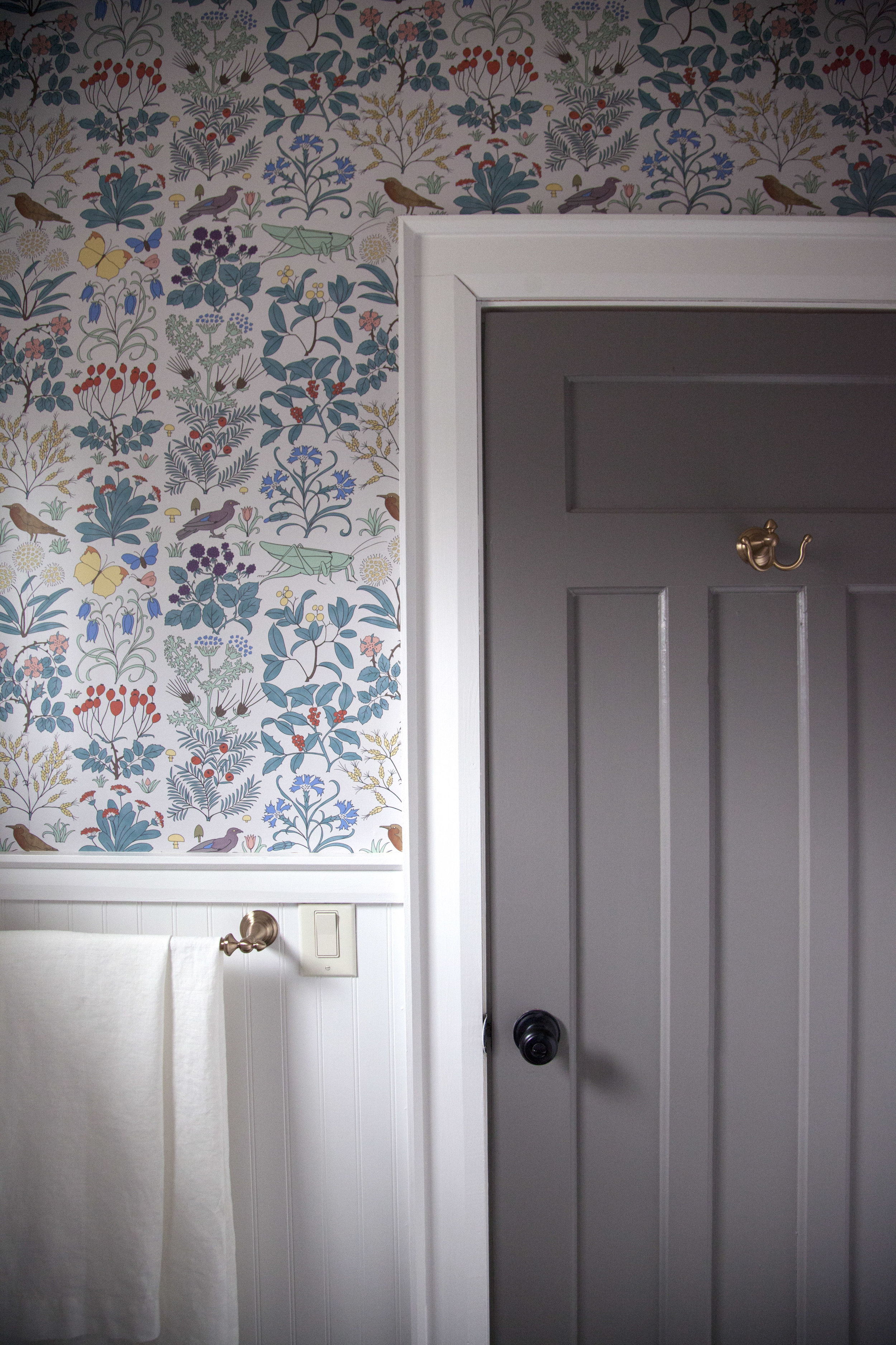
it was so hard to pick just ONE wallpaper print. i fell in love with the vintage designs by trustworth wallpaper who is run by one of the nicest artist, david berman. he sources vintage prints + fabrics & then turns them into the most beautiful wallpaper patterns you will ever see. i ended up going with "apothecary garden" in grey because it was an arts & crafts print that dates back to 1926, around the same time our house was built! it truly makes the space.
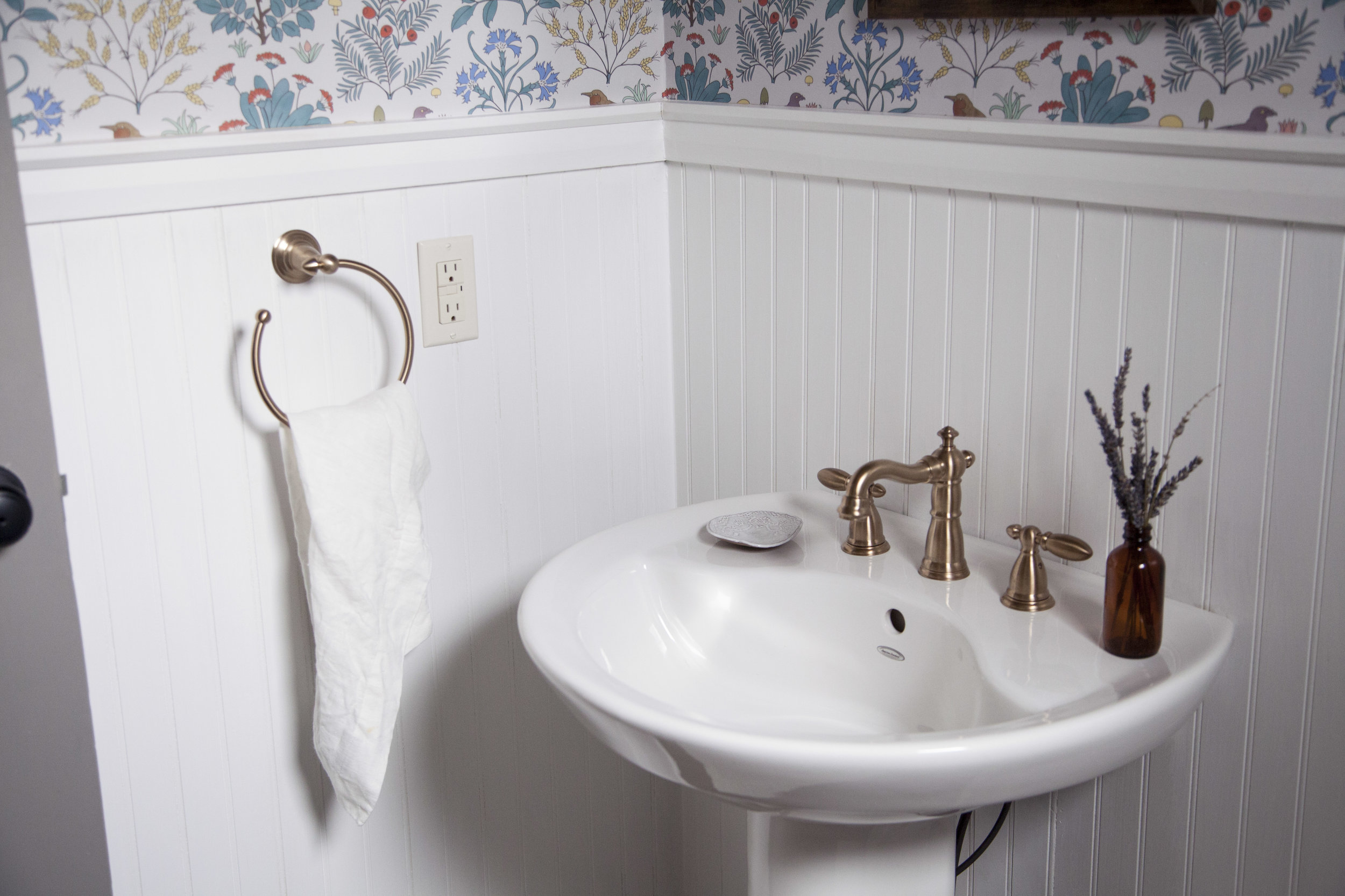
step two: the faucets & fixtures next up, i had to decide on the perfect faucet to go with the vintage wallpaper design! it seemed like a no brainer to go with brass, but delta faucet makes the most gorgeous "champagne bronze" colour too. the champagne bronze is more of a subtle brushed gold finish. not that i am against shiny brass, but it is harder to keep shiny & clean! plus this brushed bronze is perfectly gold without over powering the rest of the design elements. i went with the victorian line of faucet & accessories (towel rack, towel ring, tissue holder + door hook) to keep the whole 1920's theme i was aiming for.
step three: paint
after i decided on the two boldest designs in the room, i got to pick the rest of the design elements like light fixtures, paints & linens! i went with farrow & ball for all the paint throughout the house, so it was an obvious decision that i was using farrow & ball paint for the bathroom as well. i wanted the wood panneling to be bright & clean, so i went with "wevet" in estate emulsion for both the wood panelling & wood trim. it has the slightest of grey hue to it which went hand in hand with the grey apothecary garden wallpaper. this was actually a last minute decision i made the night before the wallpaper was installed! the original colour was a creamy white & i decided at the last possible second that it wouldn't look as nice with the wallpaper. the rest of the wood trim in the house is painted in wevet so i am happy i made the right choice in here as well. now those doors! believe it or not they were already painted grey when we purchased the house & i had the hardest time deciding to keep them grey or paint them white to match the bright white trim. in the end, grey won but we still repainted every interior door (yes EVERY single door i sanded & painted) in farrow & ball's mole's breath. mole's breath turned out a few shades lighter then the previous grey, plus we had to get rid of all those chips & cracks.
step 4: light fixtures
for the light fixtures i found the perfect sconce lights from cedar + moss, called the wyatt sconce. they have a touch of brushed brass in them, but what really caught my attention was the walnut wood base. i love that the base is a dark wood because it brings in a touch of warmth to offset the white & grey tones. plus, the shade is made of CLAY! yes CLAY! it is handmade by pigeon toe ceramics & every time someone comes over i feel the need to point out that the light fixture is actually a piece of pottery.
step 5: linens
last but not least, the linens! i am a little bit italian (okay, some would say super crazy italian) when it comes to my linens. these linens are so nice that i don't like people actually using them. the linens are from rough linen & came in a set called the "bath makeover". i went with a neutral white but struggled to pick between the dusk & charcoal. every colour was just so pretty, i can't wait to keep a set for the main bathroom was well! the quality on them is absolutely amazing, so i am slowly getting over my craziness & allowing them to be used as i know these linens will wash well for years & years. also, using 100% natural linen was the last little touch of vintage inspiration the space needed to tie it all together.
i hope you love how it turned out as much as i do! xo
SOURCE LIST: wallpaper | faucet | towel ring | towel bar | tissue holder | door hook | sconce lights | wood trim paint | wood paneling paint | door paint | towels & linens | mirror