modest farmhouse dining room


dining room reveal day is here!!! i wasn't sure if i was going to give the dining room its own blog post. what was i thinking? of course it should have its own post! for those of you who voted "hell yes" on my instagram poll, this one is for you.

it took me a little longer then i intended until the space was perfect enough to photograph, but now that i love every single piece in it, it is officially ready! the vibe i was going for here was modest x farmhouse x school house. i didn't want to create an overly formal space because the dining room is open to the kitchen. this space is both where we eat dinner every night, as well as where we host friends & family. so many memories will happen in this space for years to come.

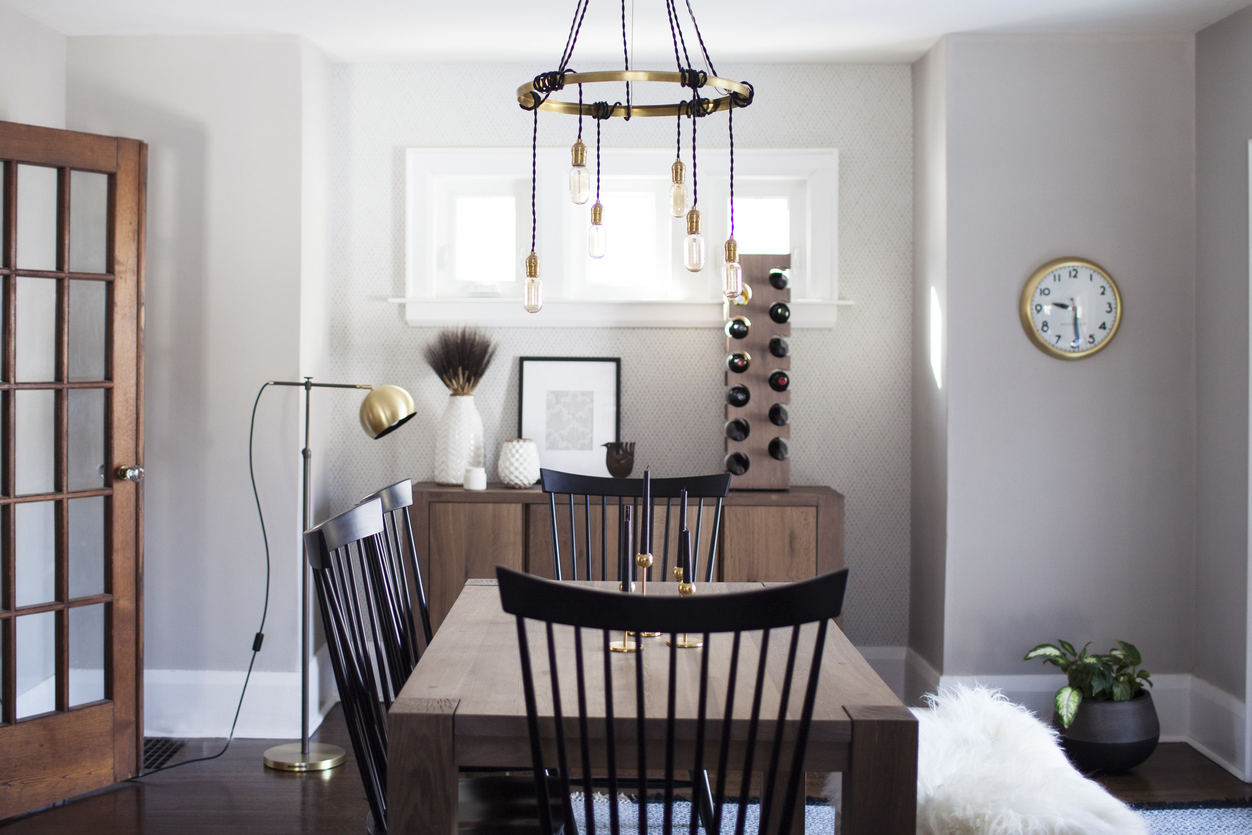
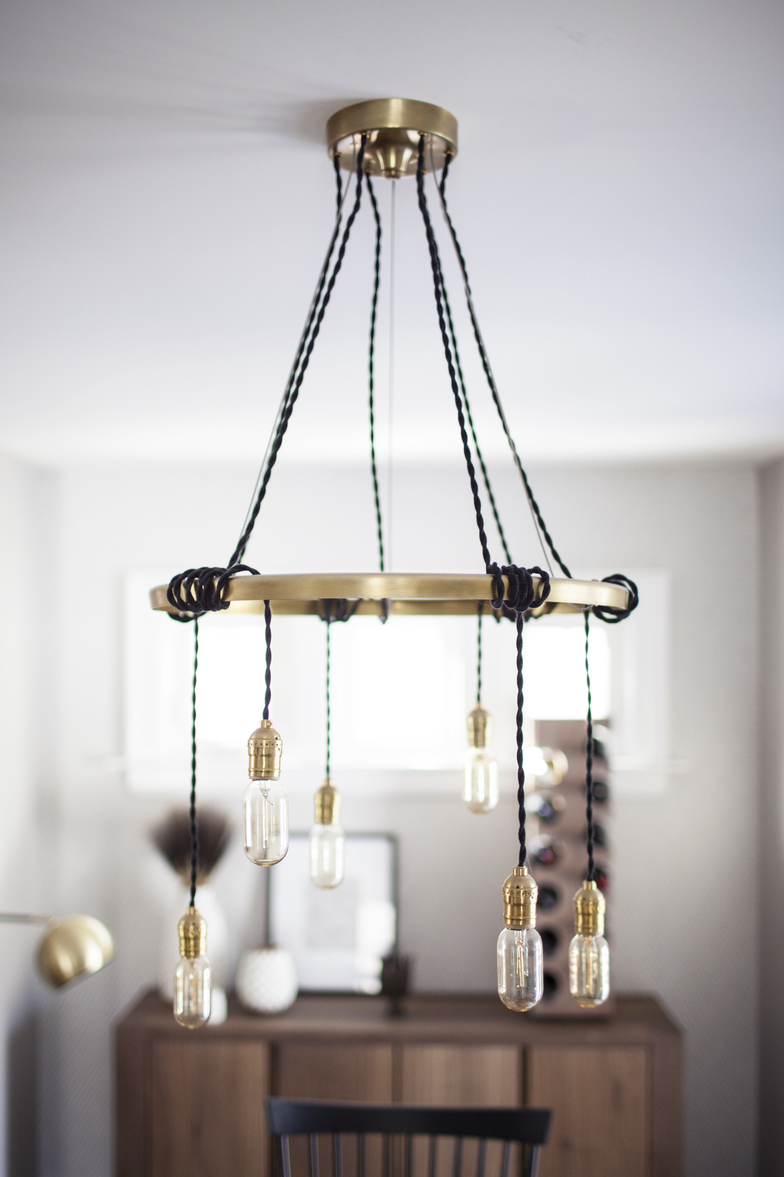
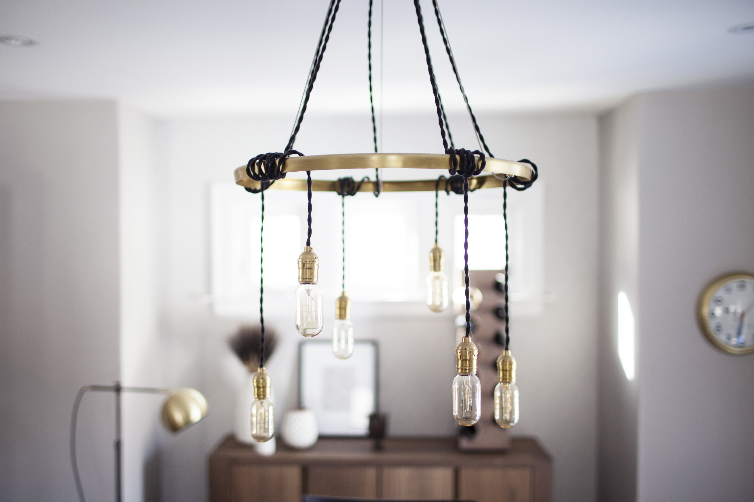
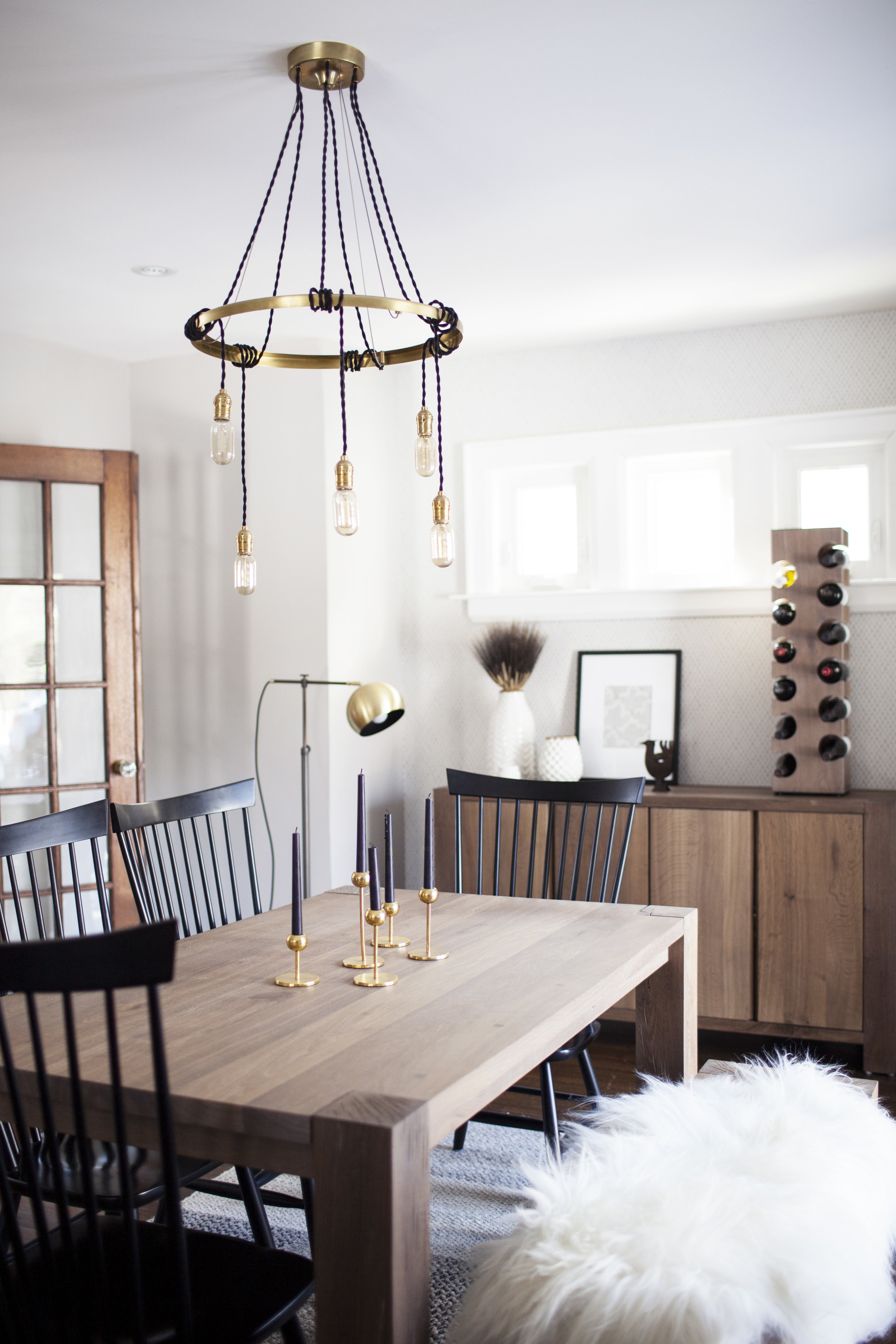
the very first thing i picked out for the dining room was the school house electric chandelier. truth be told, i don't even know if i had the keys to the house before this was ordered. i just knew i wanted something funky, bold & brass in the dining room! while i put a lot of effort into all the light fixtures throughout the house, it is the dining room that must have a stand out chandelier. we have had it for over a year now & literally every single person who walks into our house points out how unique it is. it is the "tangled chandelier" from school house electric & i couldn't recommend this light fixture enough. you can pick the colour fixture, cords, light bulbs & length!

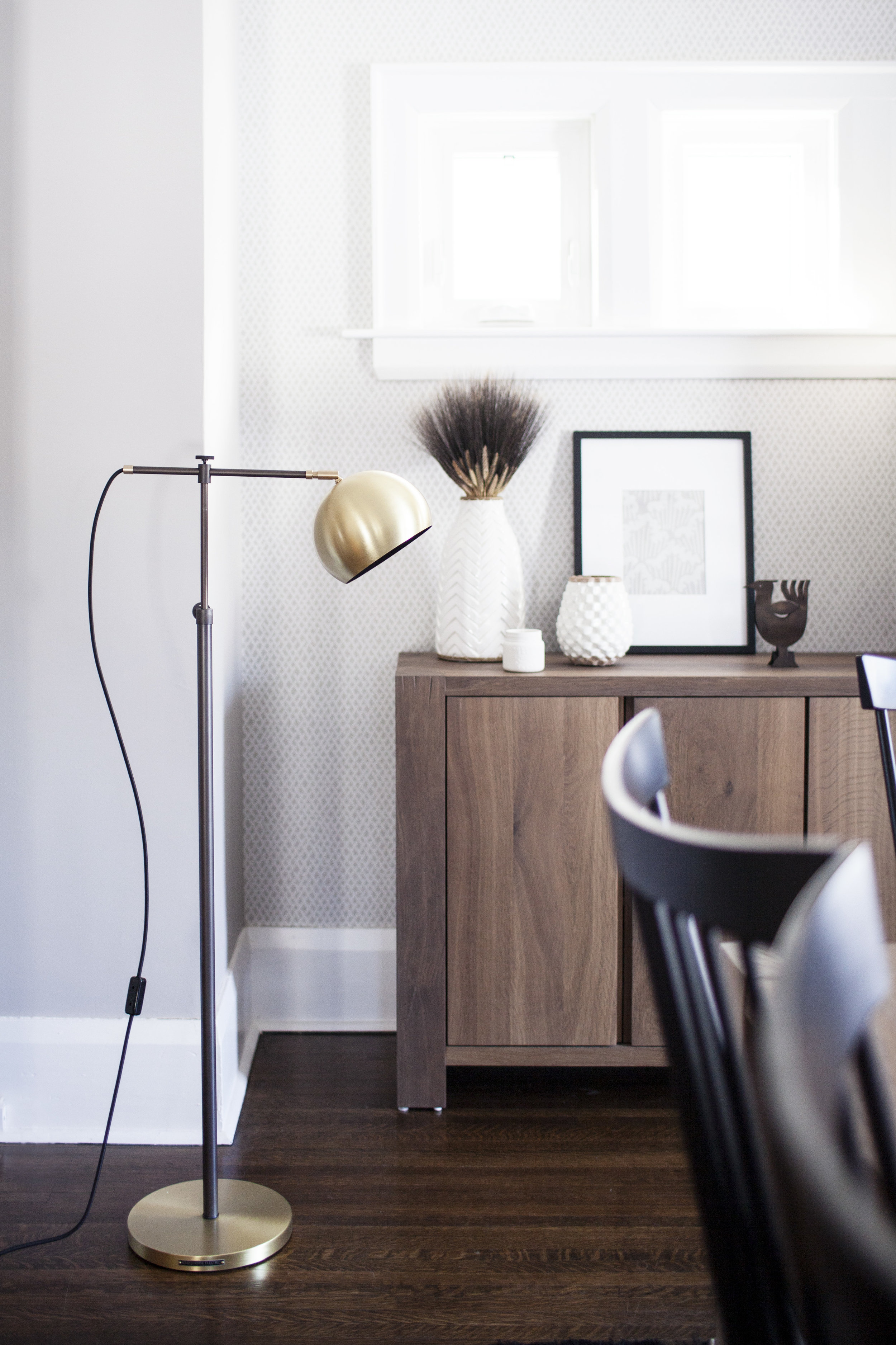
after adding the funky bold light fixture, i wanted to bring in a couple elements that complimented it. i am kind of obsessed with all things brass and black so the floor lamp & clock seemed like the perfect additions to the dining room. they also are what bring in that subtle "school house" vibe i was going for. the lamp is the "miles floor lamp" and the clock is the "kennedy clock", both from school house electric. while i was hesitant to put a floor lamp in a dining room, the lamp creates the perfect soft lighting at night. i also love how it looks in the corner that once seemed impossible to decorate.

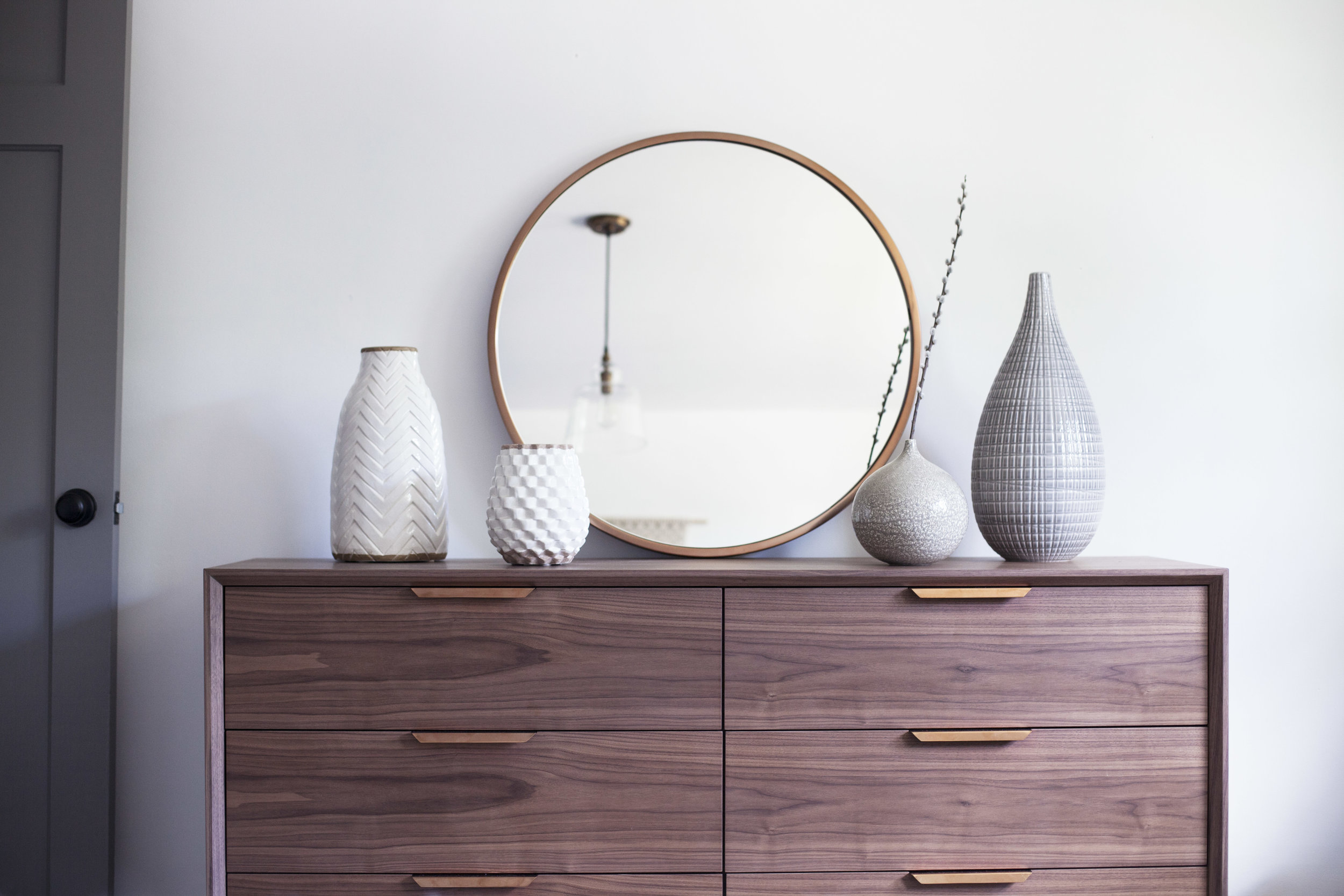
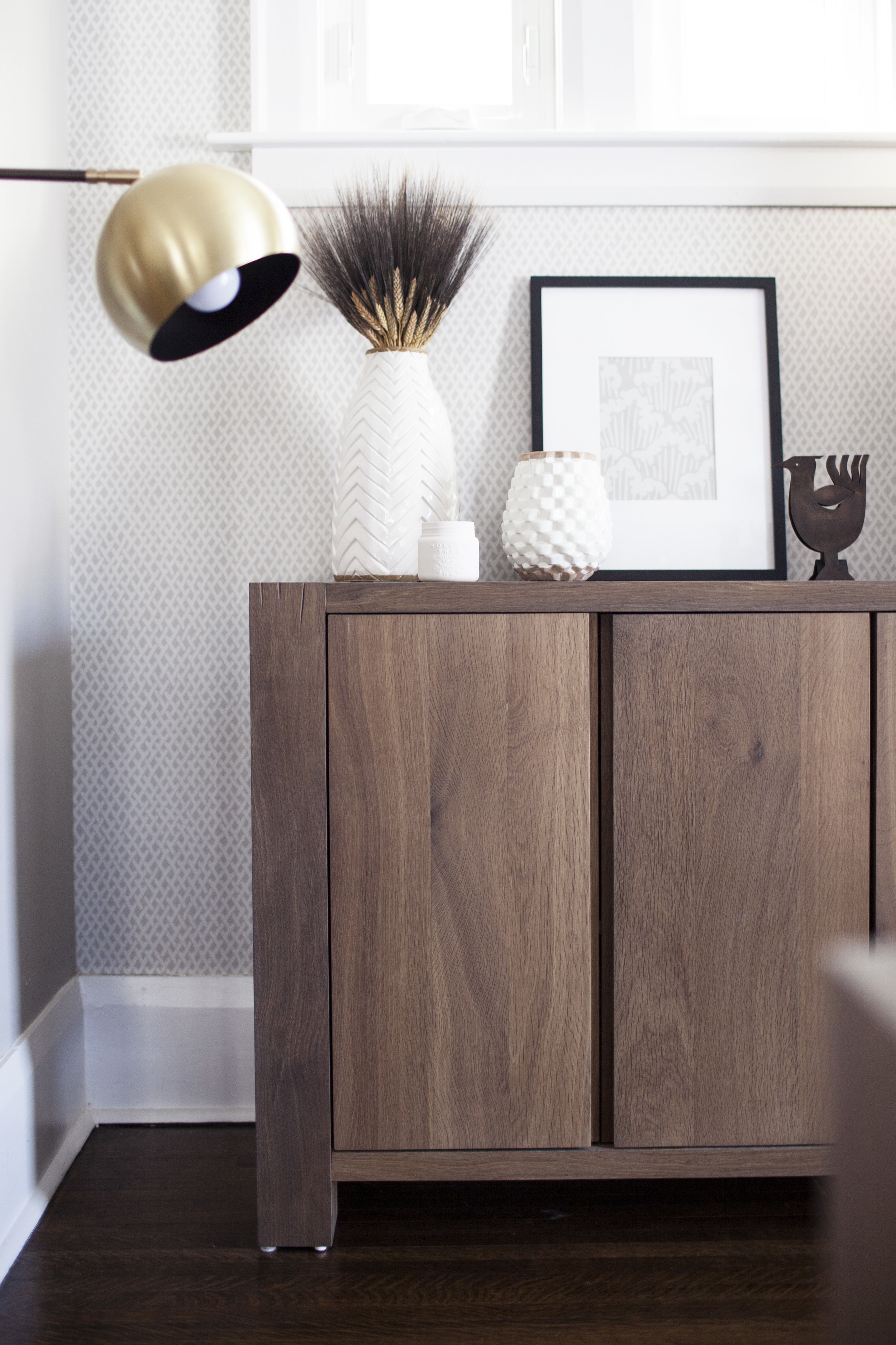
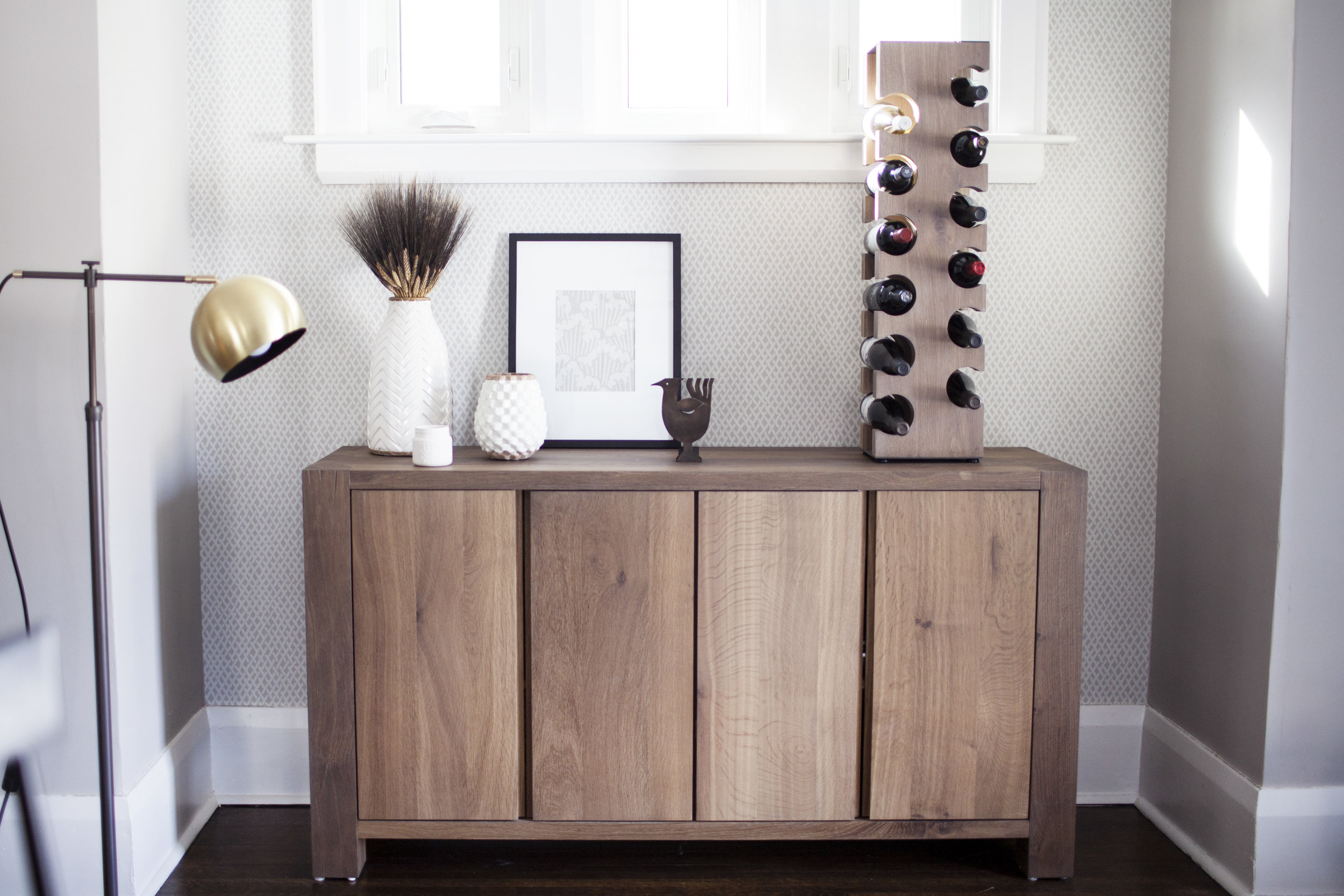
now let's get to that dining room set! i had my heart set on something minimal with clean lines. the big sur table, bench & sideboard from crate & barrel was everything i wanted & more. there is even a matching wine rack! it is made from solid european white oak with a light smoke stain. it also comes in a dark & natural finish, but i felt the smoke stain went best with our space. for the chairs i wanted something with contrast so i went with the marlow ll dining chair in black. it is a modern take on a classic windsor back chair made with solid maple. i think the dining chairs are what really adds the modern farmhouse flair to the space. they remind me of our front porch spindle rocking chairs too! when designing each room in our house, i opted for timeless pieces. something that we will enjoy for many, many years.

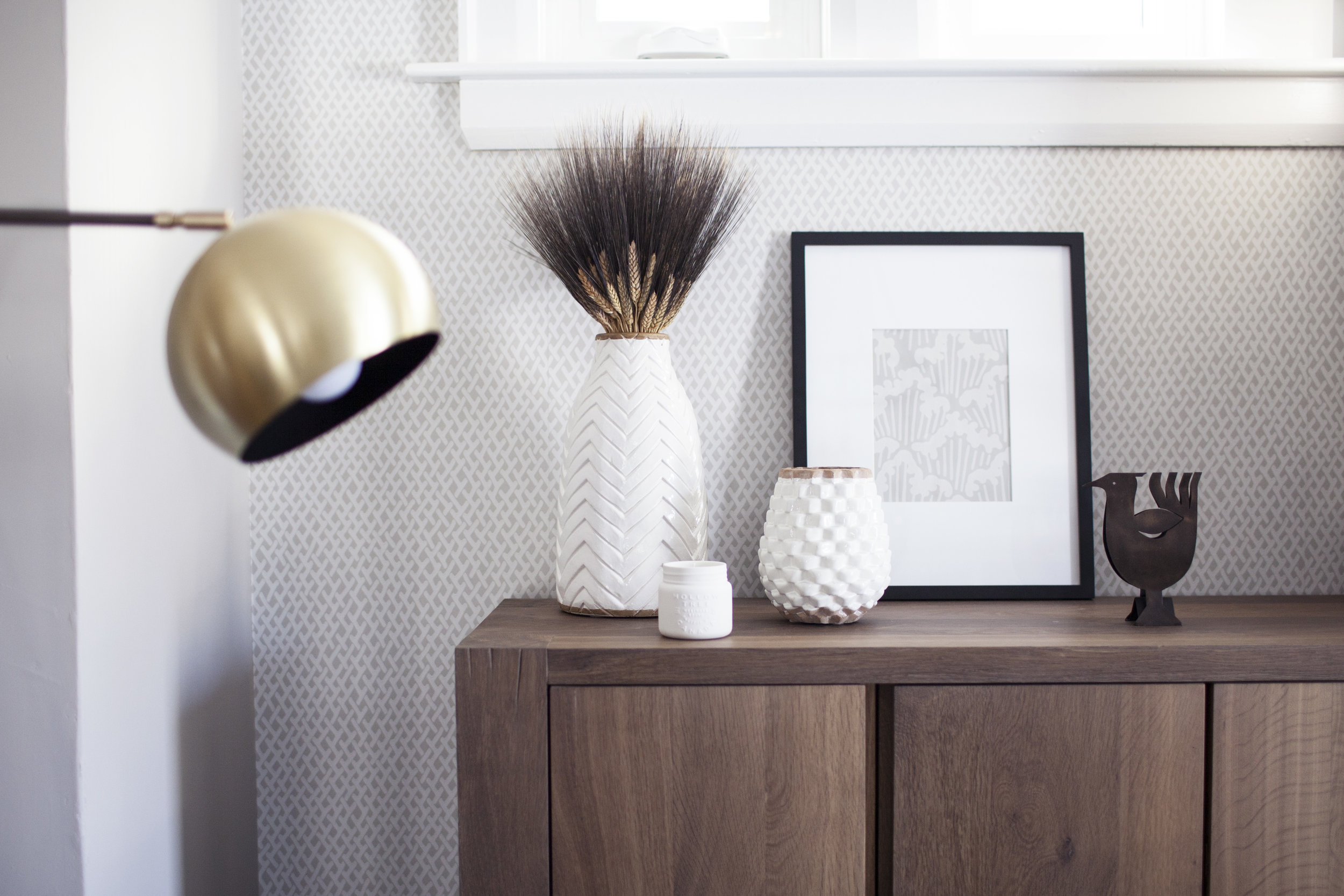
last but not least, we did a small feature wall of wallpaper to act as the backdrop to the dining room. we had leftover from the living room & i did not want something so beautiful to go to waste! adding the touch of wallpaper gave the dining room the separation it needed from the kitchen. it is also the perfect backdrop to the sideboard, isn't it! the print is amime from farrow & ball & is still my favourite print to date. the wall colour is purbeck stone and the wood trim is wevet, both by farrow & ball!

for a full list of modest house dining room sources, check out the links below! xo

hygge guest bedroom


it is finally guest bedroom reveal day!!!! you may have seen a little sneak peak over on rue magazine in july, but today i am sharing ALL the design details! this room sat empty for the first year as our focus was on finishing the main living areas of modest house. once those were complete it was time to design the ultimate retreat for future guests. my focus was on keeping the design minimal, monochromatic & cozy a.k.a HYGGE! ok, now let's get into those details..

step one: the bedroom set

the first thing we decided on was the furniture for the space. when i came across asher bedroom set from rove concepts, it was everything i had envisioned for the space. i designed the rest of the space around these gorgeous pieces of furniture. the asher line has a modern mid century flair complete with rose gold pulls on the dresser & night stands! rove concepts makes such simple & clean pieces that it caters to just about any style. i opted for the asher wide dresser as our old home lacks closet space so this is the perfect piece of furniture to store some of our extra clothing pieces as well. the asher nightstands come in two styles; one drawer or two drawer. to keep clutter to a minimum i opted for the two drawer design as i think it is always best to maxamize storage space! the furniture quality is everything i could have hoped for & more. the asher bed is low to the ground making it easy for anyone to get into, even buddy holly who is looking right at home in this space. wait a minute, is this the guest room or buddy holly's room?!

step two: paint

when it came to deciding the wall colour for the guest room space white was the obvious choice giving the hygge scandanavian vibes i was aiming for! but WHAT SHADE OF WHITE?! literally, picking white is the most stressful colour of paint to choose. you don't realize how many options there are & each shade seriously looks so different when you put them next to each other. because i absolutely loved the way farrow & ball's all white turned out in the bathroom & ceilings, we decided to stick with it for this room too. all white is exactly what it says, no other tones in it but white! we painted both the ceilings & walls in the all white to give it a seamless look, especially when old plaster walls are anything but seamless. we went with a grey white for the trim and used farrow & ball's wevet. lastly, like every other interior door in the house, we stuck to farrow & ball's mole's breath.

step three: the rug

this braided ivory wool rug was the best budget friendly find! it is 100% wool making it so inexpensive compared to all the other wool rugs online. i was a little worried about the quality since it was an online order, but it is actually perfect. it is my first piece from RUGS USA & now i want the same one for the master bedroom too. the braied wool looks so cozy & really helped tie together those hygge vibes.

step four: the details

i kept the decor very simple and versatile given that it is a guest room. i want the space to feel relaxing without being cluttered with things or looking empty. the grey linen bedding is from crate & barrel (it is on clearence right now FYI), as well as the variety of vases that grace the dresser. i decorated the bed with linen pillows in various shades of grey made by my mom & filled the wicker baskets (also from crate & barrel) with extra pendleton wool blankets incase guests get cold at night! the gorgeous grey wool throw on the bed came all the way from ireland. my parents brought it back for me on their trip to ireland this past spring knowing my obsession with wool everything.

lastly, instead of hanging a ton of wall art i kept the walls clean with the exception of the hand made ivory hanging weave over the bed frame. i purchased it from the local shop oliver & rust. if you haven't noticed through my instagram feed i love this store & am so happy to be steps away from it! i found the ivy planter & the concrete planter for each night stand there too. PLUS that cute little ceramic pear! i am obsessed with it & got one for the mantel as well.

anyways, that is everything you need to know about the guest bedroom in modest house! our dream is to one day own a bed & breakfast, so having the perfect guest retreat is a nice way to start.

master bath refresh


in my opinion, spring is the perfect time for a little bathroom refresh! now i can't take full credit for this gorgeous bathroom. the previous owner had already done the most beautiful renovation featuring a marble shower & a custom marble vanity. it was one of the features in the house that won my heart over. it is the only full bathroom in the house, but unlike every couple on hgtv i really didn't care about an ensuite. one full bathroom featuring both a bathtub & shower was plently! who wants to clean multiple bathrooms anyways? not me. there was just some minor things i wanted to change to the space & personalize it with my own touch.

step one: the paint

the original colour of the space was a powder blue. i am not big on colour when it comes to wall paint (or anywhere) so i knew i wanted to change it to white. we actually ended up having to paint it TWICE! the first colour i chose turned out just awful, it had a beige tone to it & simply looked like a dirty off white. FARROW AND BALL TO THE RESCUE! i talked with my friend over at dreamy white lifestyles who seems to have done her research when it came to finding the perfect shade of white. i wanted something with no undertones so she recommended her favourite colour all white! farrow and ball's all white in estate emulsion is perfect. it is clean, bright & has that perfect chalky finish. i stuck to farrow and ball's wevet for the trim to match the rest of the house, which is actually a touch darker then the walls & has a slight grey hue to it. it is something you don't notice in the other rooms, but when you put it up to a clean white you finally see the hint of grey! lastly, i painted the door farrow and ball's mole's breath to bring in a touch of grey & pull from those marble veins.

step two: the lighting

the previous lighting in the space was very classy & square, but i tend to lean towards more school house & industrial vibes. the mirror was a huge frameless mirror that i had no intentions of changing, but we accidentally broke it when we painted! so i chose to get both the mirror & light fixtures from restoration hardware. i am obsessed with this store, but we all are.. right?! i am so happy how the shadeless sconce lights look along side the chrome framed mirror. i chose the same school house style light fixture for the spare room & office, but in the bathroom i went for the clear shade instead of the milk glass. the clear shade looks a little more elegant & i love how the vintage edison bulb is visible to match the scones lights.

step three: the hardware

the faucets in the sink, tub & shower are all moen's kingsley line. the hardware, however was not. i managed to find all the matching pieces to moen's kingsley line on wayfair (p.s. yay to free shipping in canada)! they sell the faucets featured in this space too. i installed a toilet paper holder, towel bar, glass shelf & towel hook in the matching chrome finish. the beautiful shelf above the bath is the perfect spot to hold candles as well as a place to rest your glasses/jewlery before you get into the bath tub. the towel hook i installed next to the shower makes it so much easier to just grab your towel before getting out of the shower. it is WAY to cold to get out & search for a towel! lastly, that cute modern farmhouse basket where i store the extra towels is from wayfair as well. it is perfect to hold just about anything in & even comes in a copper finish!!!

step four: the linens

i chose the same rough linen bath makeover that i used in the powder room design. not to sound like a broken record, but i just can't get enough of rough linen's linen! the quality, the texture.. everything about it is perfect. trish (the owner) did such an amazing job sourcing the perfect fabric. featured are the "natural" coloured linens, but i think the grey would look just as amazing! i just saw they released linen baby blankets now too, i kind of want to get one for buddy. she is close enough to a little baby! maybe it would keep her out of my linen bedding every morning, but doubtful.

check out all the sources at the links below:)